The Strategy Behind a Successful Homepage
Most people think a homepage is “the pretty part.” The design, the visuals, the colors, the layouts. But a successful homepage starts long before design ever enters the conversation.
A homepage is a strategic tool — a narrative, a decision-making engine, and the single most powerful piece of real estate on your website. When it’s structured well, your homepage gives visitors immediate clarity, builds trust, and moves them toward the next step with confidence. When it’s not, people bounce. They scroll with confusion. They leave without understanding who you are or why it matters.
The problem isn’t that people don’t care. It’s that the homepage didn’t do its job.
Why the Homepage Matters More Than Ever
User behavior in 2026 is fast, distracted, and mobile-first.
Research shows that:
People form an impression of your brand within 0.05 seconds
They skim, scan, and jump around the page
Mobile visitors often only see the hero section before deciding to stay or leave
Your homepage has one job:
Give the right information, in the right order, without making people work for it.
The Real Goal of a Homepage (It’s Not “Look Good”)
A beautiful homepage is a bonus — not the strategy.
A successful homepage must answer three questions within the first few seconds:
What do you do?
Who is it for?
What should they do next?
When any of these three pieces are unclear, visitors stall. They scroll without direction. They look for context. They leave.
A homepage is successful when it guides people effortlessly — not when it overwhelms them.
The Core Elements Every Homepage Needs
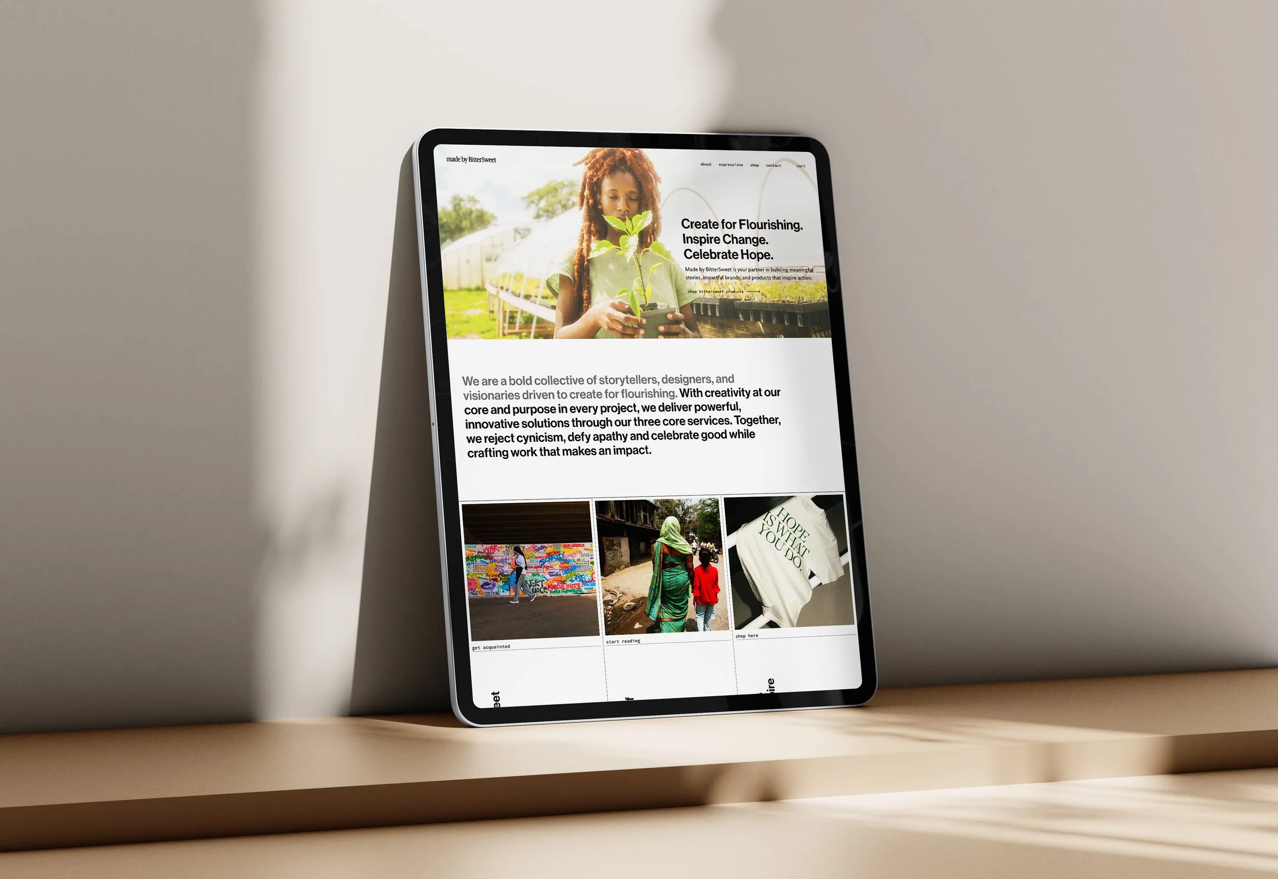
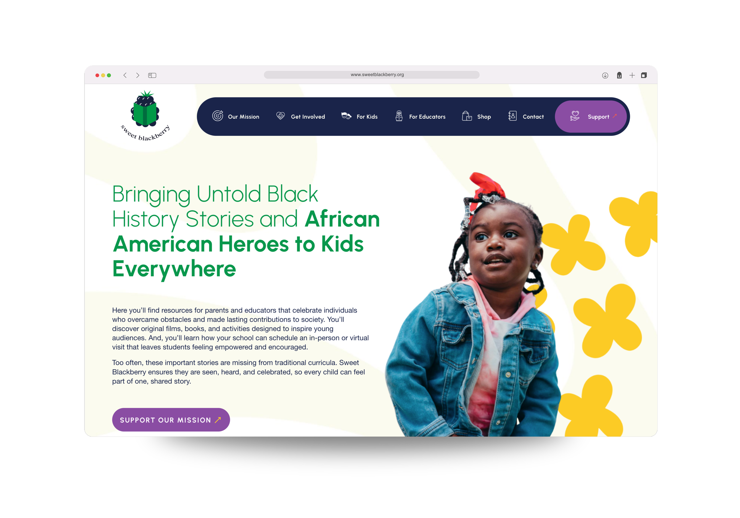
A clear, direct hero statement
Your hero is not the place for poetry, cleverness, or long intros.
It should be sharp, outcome-focused, and written in plain language.
Examples:
“Brand and web design for mission-driven founders.”
“Helping authors build platforms that attract publishers and readers.”
“Custom websites built to scale your business.”
Clarity outperforms creativity every time.
Strong visual hierarchy
Hierarchy tells visitors where to look and what matters.
This includes:
Clean spacing
Distinct sections
Headings that do real work
Buttons that stand out
Logical flow from top to bottom
A strong homepage isn’t crowded. It breathes. It guides.
Social proof that builds trust
People trust what other people trust.
That means:
Testimonials
Logos
Press mentions
Case studies
Award badges (if relevant)
You don’t need all of these. You just need the ones that matter.
A simple, obvious CTA
One primary call-to-action.
Not five. Not seven. Not a sea of buttons.
People convert when they know what to do.
Examples:
Book a consultation
View services
Start your project
Shop new arrivals
A homepage with no CTA is a homepage with no direction.
A concise services overview
Your homepage shouldn’t list every detail of your offer suite.
It should give visitors a clear snapshot of what you provide.
Three to four services is plenty.
From there, internal pages do the heavy lifting.
Proof of credibility
This can be subtle — a small section, one row of logos, or an awards snippet.
Credibility signals tell visitors they’re in the right place.
What Makes a Homepage Fail
It’s not the template. It’s not the platform. It’s rarely the color palette.
Homepages fail because they lack structure.
Common issues:
Too much text
No messaging hierarchy
Overwhelming visuals
Confusing navigation
No CTA
No credibility markers
No clear benefit or outcome
Design that doesn’t match the brand’s maturity
A homepage can be beautiful and still fail.
A homepage can be simple and succeed.
The difference is strategy.
Homepage Strategy vs Homepage Design
Design answers the question:
What will this look like?
Strategy answers:
Why does this matter, and how will it work?
Homepage strategy includes:
Understanding your user
Deciding what information they need first
Structuring the page in a logical order
Mapping the user journey
Choosing the right messages, not the most messages
Prioritizing clarity
Designing with conversion in mind
When strategy comes first, design becomes intentional instead of decorative.
How to Improve Your Existing Homepage
If your homepage feels unclear, scattered, or outdated, start here:
Quick Homepage Audit Checklist:
Does the hero clearly state what you do and who it’s for?
Is there one primary CTA?
Can someone understand your offer categories in five seconds?
Do you have at least one trust marker?
Does your homepage flow in a logical order?
Are you using clear, non-generic messaging?
If you answered “no” to more than two of these, your homepage needs refinement — not a full rebuild, just strategic adjustments.
Your homepage is the foundation of your digital presence. When it's structured with intention — not just designed to look good — it becomes one of the most powerful tools for clarity, brand building, and conversion.