Choosing the Best Squarespace Fonts & Pairings for 2026
Typography is one of the easiest ways to elevate a Squarespace website — and one of the fastest ways to weaken it if you choose fonts that don’t support your brand. In 2026, strong typography is less about trend-driven aesthetics and more about clarity, accessibility, and brand presence.
The right font pairing communicates personality. It sets the tone for your brand before a visitor reads a single sentence. More importantly, good typography makes your content effortless to scan, especially on mobile.
Here’s how to choose the best Squarespace fonts and pairings for 2026.
Why Typography Matters More Than Ever
Typography is a first impression. It influences how credible, modern, or polished your brand feels.
In 2026, user behavior leans heavily toward:
quick scanning
mobile-first browsing
shorter attention spans
preference for generous spacing and clear hierarchy
Good typography supports the user.
Poor typography forces them to work.

Understanding Squarespace’s Font System
Squarespace keeps typography simple through:
Font Packs (pre-made combinations)
Global style controls
Heading / Paragraph style settings
Font weight and spacing adjustments
You can also upload custom fonts, but most brands should start with built-in options. These fonts are optimized for web, load fast, and come with pre-balanced pairings that make your design cleaner with less effort.
How to Choose Fonts That Match Your Brand
Pick fonts based on brand personality
Typography reflects brand tone. Consider:
Modern
Classic
Editorial
Playful
Elegant
Minimal
A soft serif won’t match a bold, tech-forward brand — and a geometric sans won’t match a luxury boutique.
Prioritize readability on mobile
This matters more than style.
Choose:
medium weights
comfortable sizes
generous line spacing
high contrast
Thin fonts may look beautiful on desktop but collapse on mobile.
Contrast your heading and body fonts
Contrast creates hierarchy.
Pair:
Serif heading + sans-serif body
Sans-serif heading + serif body
Bold heading + neutral body font
If your fonts feel too similar, your content feels flat.
Limit your styles
A common mistake is using:
too many sizes
too many weights
decorative fonts for body text
Consistency builds trust. A homepage doesn’t need more than two fonts — and Squarespace agrees.
Need help designing your Squarespace website?
Choosing the right fonts is just one piece of creating a website that converts. If you're ready to build a strategic Squarespace site that reflects your brand and drives results, let's talk.
The Best Squarespace Font Pairings for 2026
Here are modern, reliable combinations that balance style and readability.
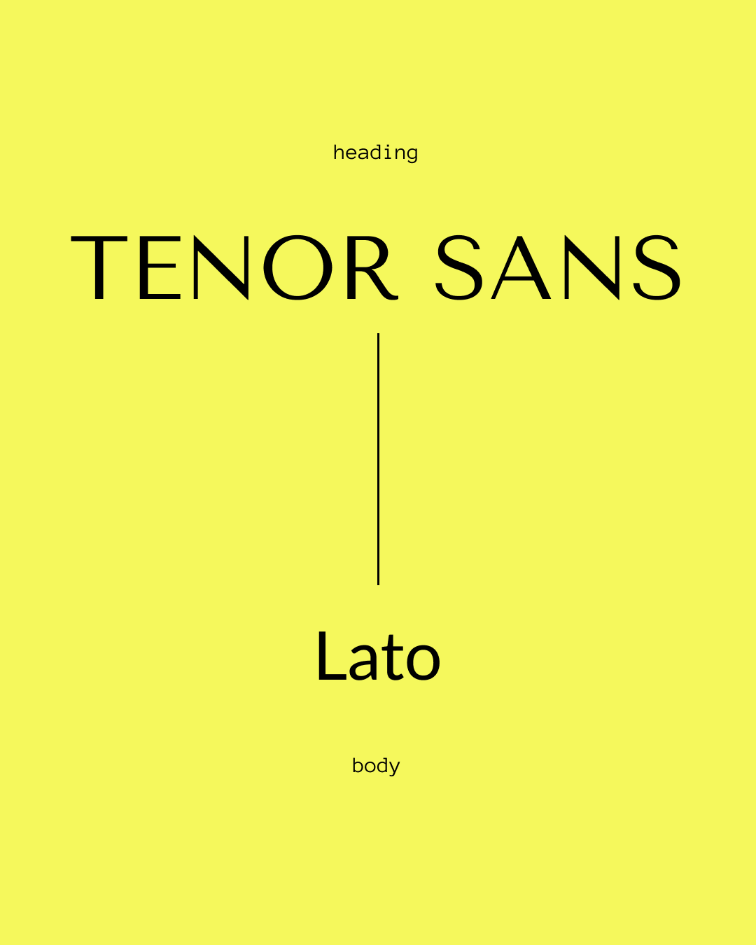
Tenor Sans + Lato
Clean, modern, minimal — great for founders, coaches, small businesses.

Playfair Display + Source Sans Pro
Editorial meets approachable. Perfect for authors and creative brands.
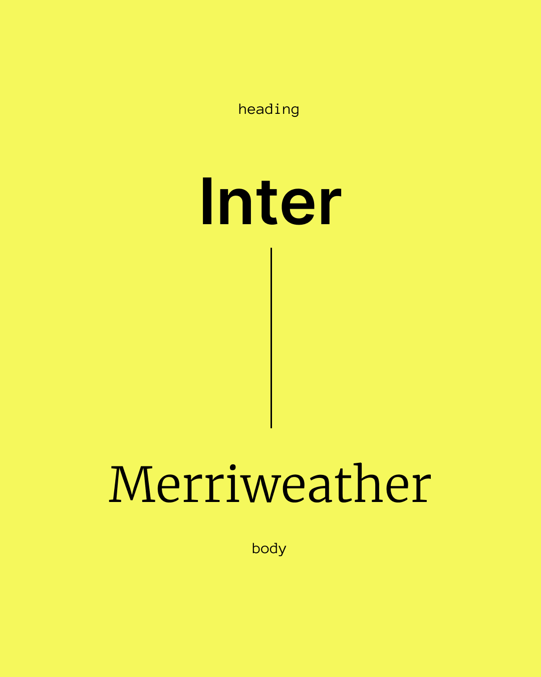
Inter + Merriweather
High contrast, excellent on mobile, and extremely readable.
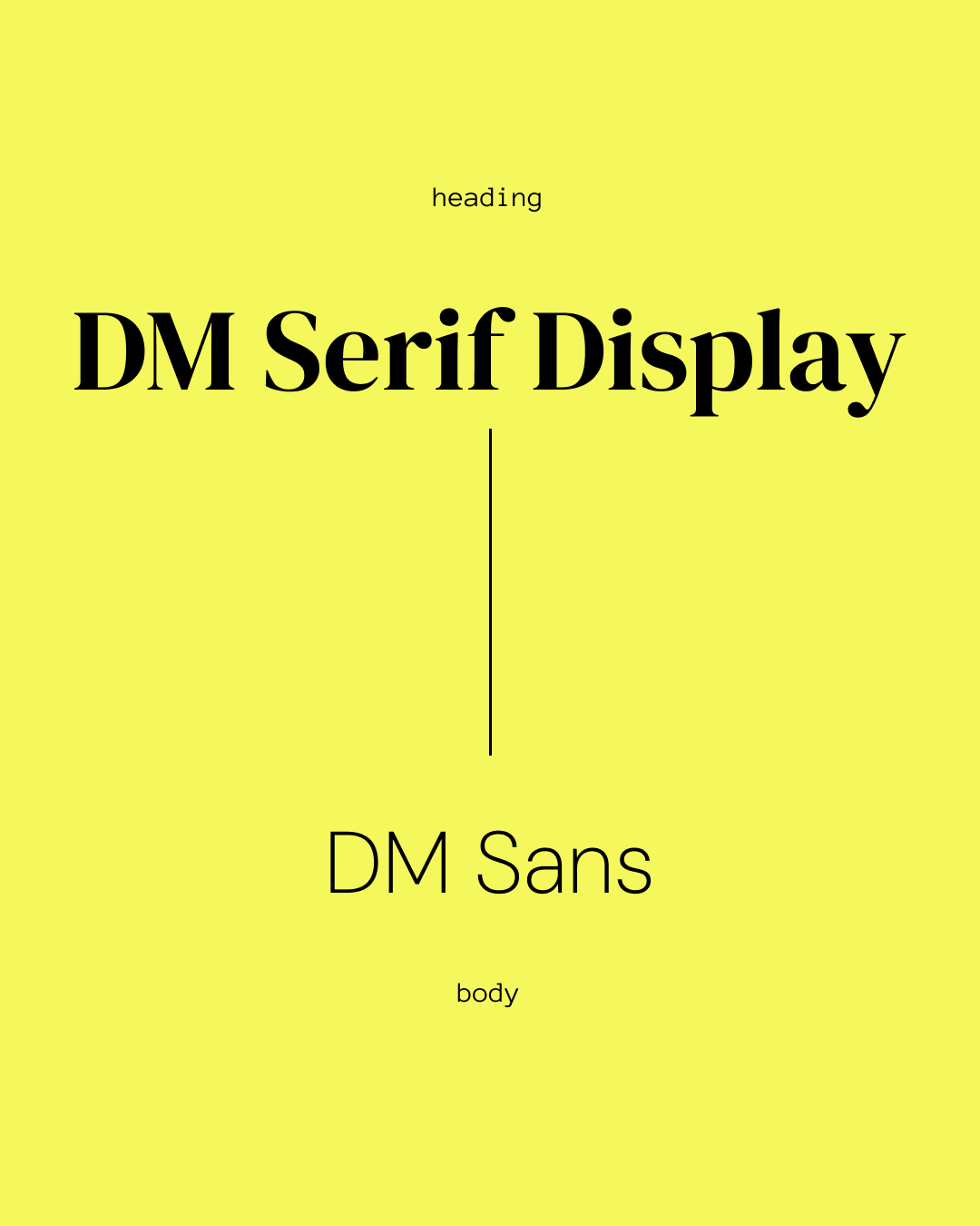
DM Serif Display + DM Sans
Elegant, feminine, and modern — strong for creative studios and lifestyle brands.
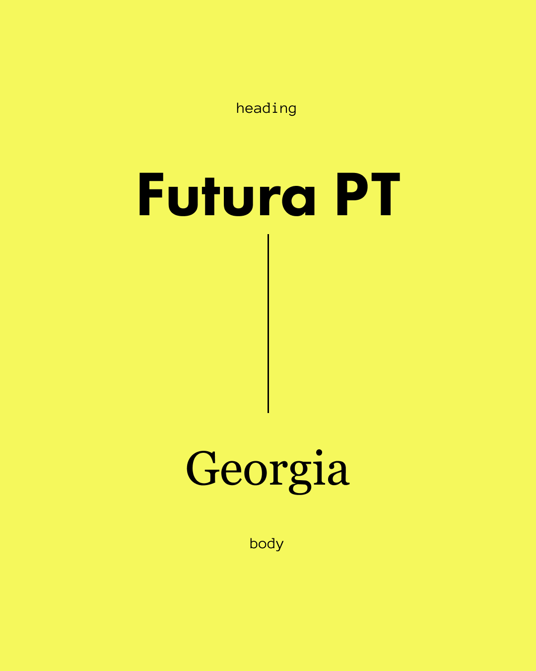
Futura PT + Georgia
Bold personality heading + timeless body text.
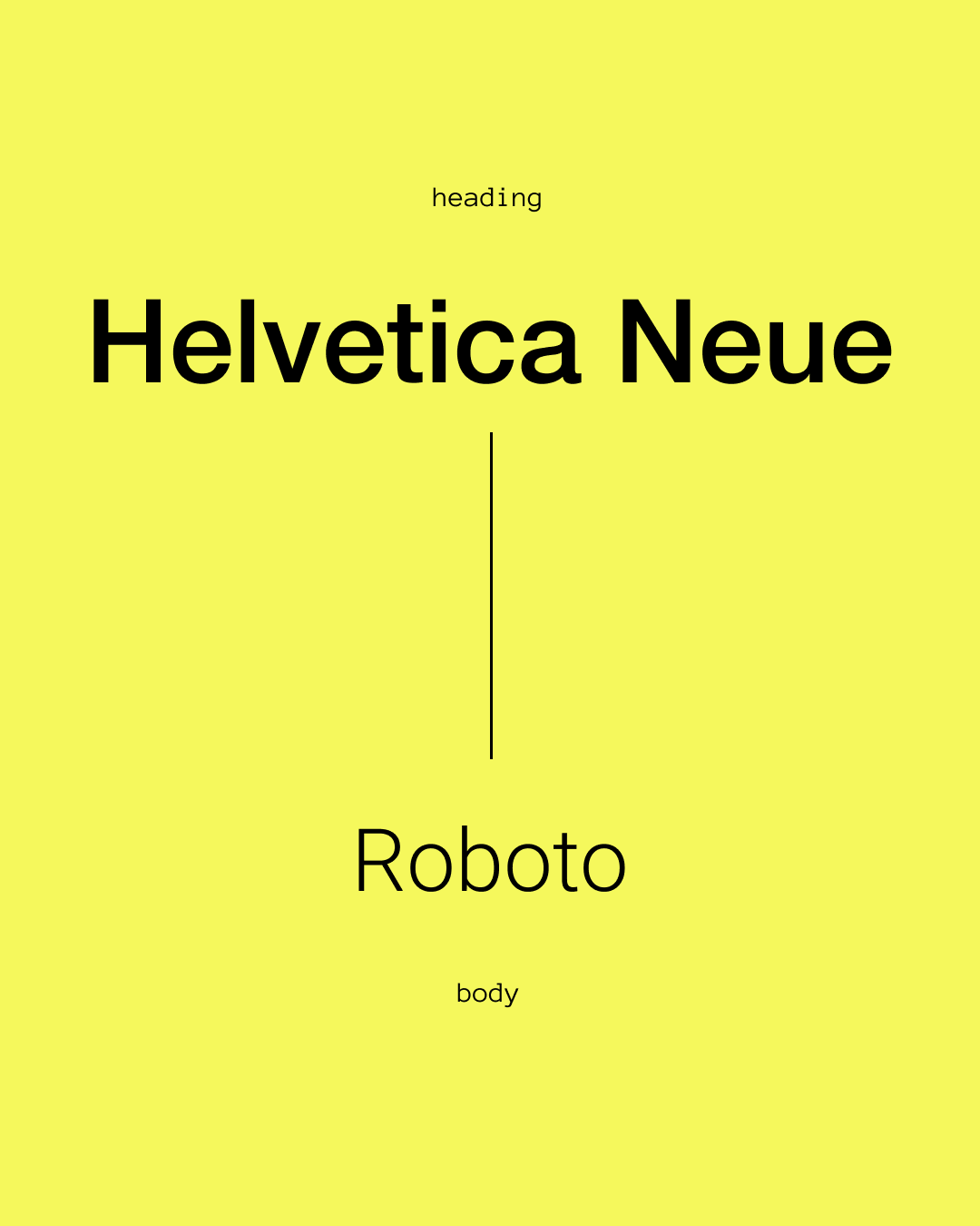
Helvetica Neue + Roboto
Safe, clean, and familiar — works in almost any industry.
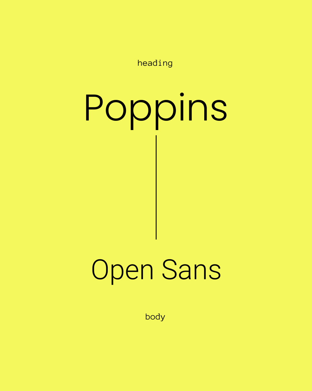
Poppins + Open Sans
Rounded, friendly, and highly readable for education or community sites.
These pairings work well across Squarespace templates and give you a polished look without overthinking the design.
Common Typography Mistakes on Squarespace
Avoid these to immediately improve your design:
Using more than two font families
Choosing thin weights that disappear on mobile
Low color contrast
Decorative scripts for body text
Extremely tight or loose spacing
Inconsistent sizes across pages
Your typography should guide the user, not distract them.
How to Apply Fonts Strategically on Squarespace
Squarespace gives you more control than people realize.
Use Font Packs as a starting point
They are balanced and tested.
Adjust heading weights for better impact
Avoid overly thin H1 or H2 fonts.
Increase line-height for readability
Especially for paragraph text.
Use custom fonts only when necessary
Brands with established identity may need custom uploads — but keep performance in mind.
Check your site on mobile before you finalize your fonts
What looks perfect on desktop often behaves differently on a phone.
Ready to Build a Strategic Squarespace Website?
Typography matters—but it's just the foundation. A truly effective website combines beautiful design with strategic thinking, clear messaging, and user experience that converts. If you're ready to invest in a Squarespace website that works as hard as you do, we'd love to help.