The Future in Black™The Future in Black: From AI Studio to Cultural Intelligence
TypeLanding Page
rolesBrand Strategy & Messaging
Identity Update
Pitch Deck Design
UX/UI & Web Design
developerlive siteThe Overview
The Future in Black™ is a cultural intelligence studio founded by Joy Fennell. Through Play as Practice™, her proprietary methodology, TFIB uses imagination, play, and storytelling to help brands understand and shape what comes next. The studio's work spans cultural strategy, brand partnerships, editorial programming, and luxury collaboration. Joy had already earned partnerships with Adobe Firefly, editorial presence across fashion and culture, and a growing institutional reputation. What she needed was a brand foundation that matched where the studio actually was, and a website that made it undeniable.
The Challenge
The existing website positioned TFIB as an AI-powered design studio in the Web3 space. That framing competed in the wrong category, attracted the wrong clients, and buried the proprietary methodology that makes TFIB distinct. There was no cohesive visual system, no formalized color story, and no pitch materials that could travel without Joy in the room. The work had arrived. The presentation hadn't.
The Research & DiscoveryThe brand guidelines make the positioning explicit: The Future in Black™ is not a diversity consultancy, a personal brand, or an agency built to service demand.
It is a cultural intelligence studio at the intersection of Black creativity, luxury, and technology, shaping the future rather than serving it.
That distinction drove every decision. We mapped what the brand needed to communicate to three distinct audiences simultaneously:
Luxury brands and cultural institutions — Partners at this level need to see institutional credibility and a named methodology before any conversation begins. The brand had to feel like it had already arrived, not like it was seeking permission.
Curators and creative collaborators — They need to understand the practice, the editorial voice through Signal and The Frequency, and the Afro-Surrealist Renaissance aesthetic that runs beneath the work.
Individual creators and emerging studios — They arrive through social and newsletter. They need to feel invited into the practice, not talked at from above.
All three audiences had to be held simultaneously, without the brand collapsing its register to accommodate any single one.
phase 01Brand Foundation
Messaging first. The first thing we locked was positioning language. The brand voice is authoritative, poetic, and institutional. TFIB speaks like an institution that has already arrived, not one seeking permission. The tone is deliberate and visionary, grounded in craft and practice, and never corporate. That language became the anchor for every visual decision that followed.
The wordmark. The existing logo had inconsistencies in weight and casing across different uses. We standardized it: all caps, uniform bold weight throughout, no hierarchy between words. No single word carries more emphasis than another. The mark reads as a single declaration. Three usage variants were defined: horizontal, stacked, and the TFIB™ abbreviation for contexts that require compression.
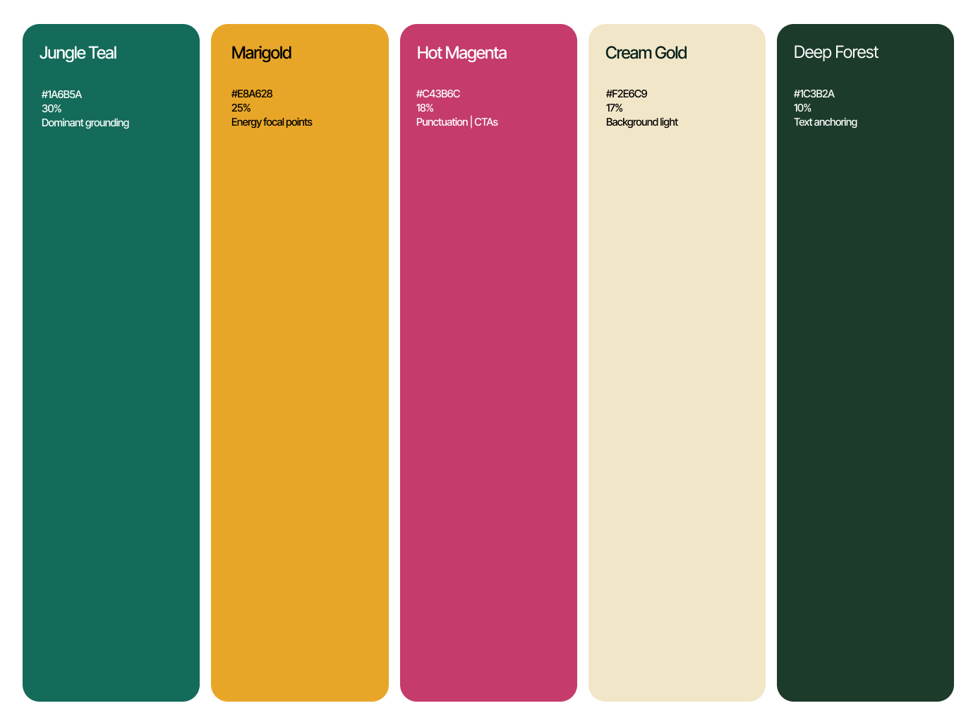
The color story. The Gilded Tropics palette was built from TFIB's mood board references, pulled from Gucci-adjacent greens, bold yellows, and rich teal moments. Five colors, each with a defined role and usage ratio. The palette positions TFIB at the intersection of editorial luxury and cultural vibrancy. Jungle Teal and Deep Forest anchor the brand in sophistication. Marigold and Hot Magenta inject the energy of Play as Practice™. Together they signal that the studio operates on its own cultural terms.
The type system. Inter Tight was selected as the primary typeface across all applications. It is a condensed sans-serif that balances modern clarity with typographic precision, and it works across both digital and print. The hierarchy was defined across five levels, with specific tracking values at each level to maintain the brand's density and rhythm.


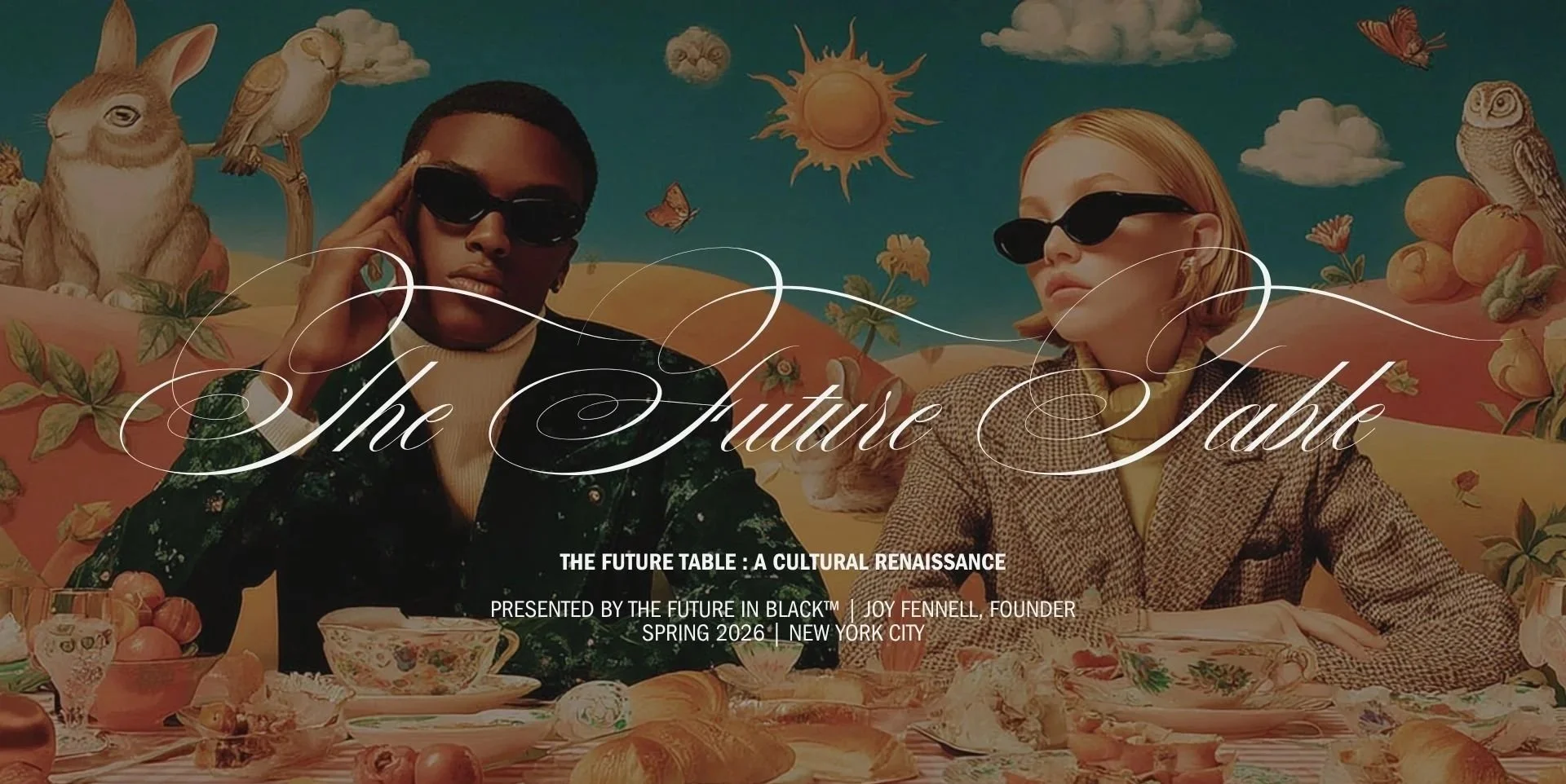
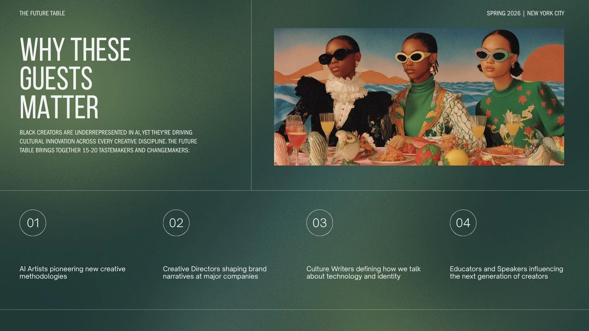
phase 02Pitch Deck
With the brand foundation in place, Joy had an immediate high-stakes opportunity: a partnership proposal for a major creative technology platform. The Future Table, a concept rooted in the Afro-Surrealist Renaissance aesthetic, served as the centerpiece.
The deck was built to represent TFIB at the institutional level without Joy needing to be in the room to contextualize it. The brand foundation did that work. The Gilded Tropics palette runs throughout. The visual language answers the unspoken question before the conversation begins.

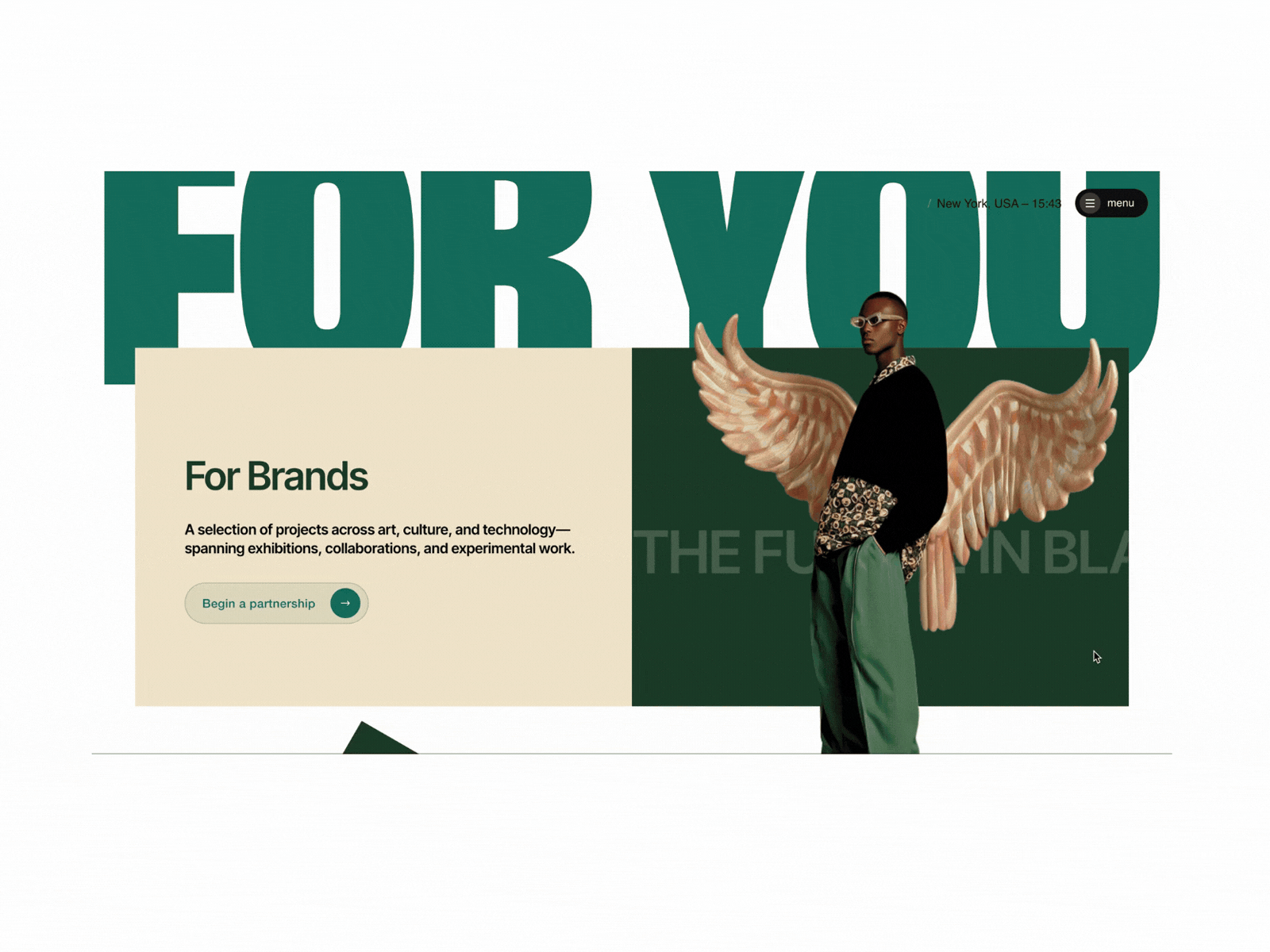
phase 03Website Design & Development
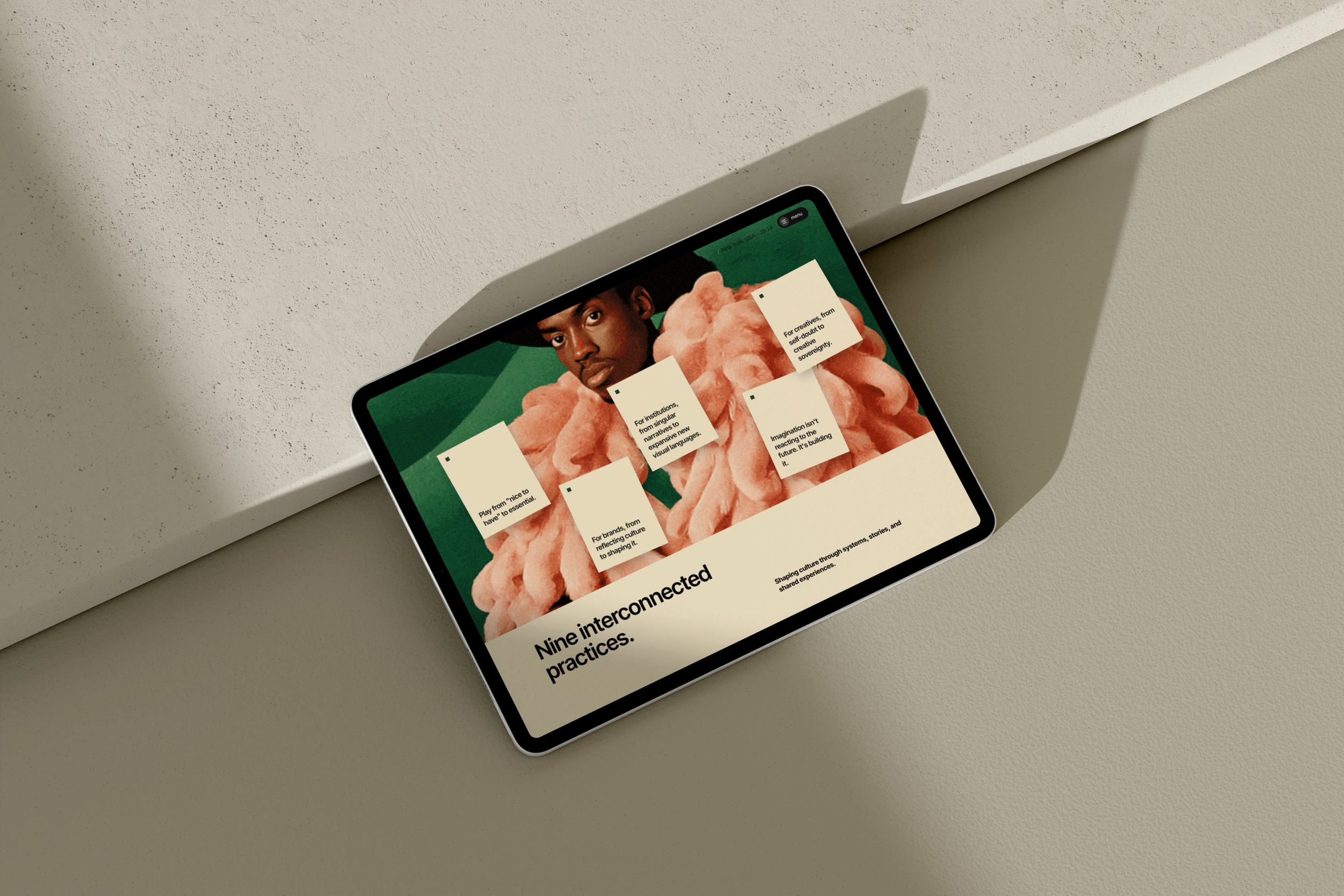
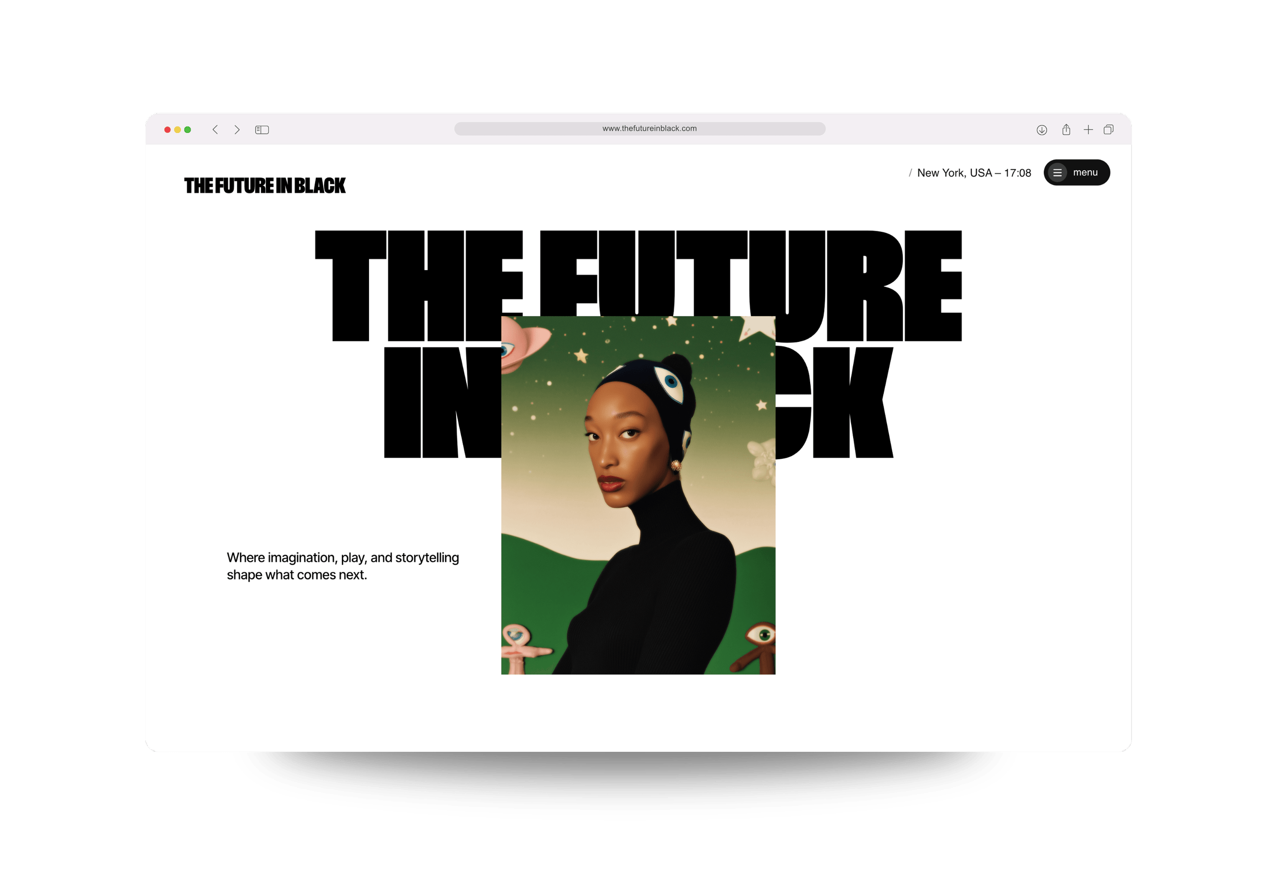
The site opens with the brand in full. The name, the mission, and the aesthetic have room to land before anything competes for attention. The navigation is organized around what TFIB does, represents, and offers as a studio with a distinct intellectual identity, not an agency portfolio.
Play as Practice™ is the intellectual center of the site. The Nine Practices are named and given space. For a visitor arriving from a luxury brand or cultural institution, this signals rigor: a named, repeatable framework with depth.
Signal and The Frequency are integrated as live credibility infrastructure, not a blog. They position TFIB as a studio actively generating cultural discourse.
The scroll experience was built to embody the methodology directly. The text-clipping mask hero, the expanding full-bleed image, the floating cards — these are not decorative. They are a site that behaves the way TFIB thinks: expansive, layered, and alive.

what they’re sayingWorking with Kia at Golden Launch Creative has been one of the best decisions I've made for The Future in Black™.
From the brand foundation to the color story, the typography system to the final design, she met every layer of my vision with intention, care, and serious craft. The new TFIB site is everything I imagined and more, and the fact that it's already being featured on platforms like I Love Creatives and nominated for an Awwwards says everything about her work. If you're a creative looking for someone who actually sees what you're building, Kia is the one.
–Joy Fennell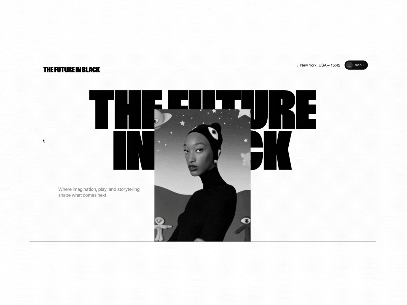
Within days of launching, The Future in Black™ received recognition from some of the most respected voices in web design:
Nominated by AWWWARDS
Featured by ilovecreatives
Featured by Site of Sites
Featured by A1 Gallery — one of only five Squarespace sites in the entire gallery
Featured in the Squarestylist newsletter
Five features at launch. For a Squarespace build. This is what happens when strategy, design, and development are fully in sync.

Final DesignThe Design Impact
Three phases of work aligned into one continuous brand story. The repositioning from AI design studio to cultural intelligence studio is now legible at first glance, across every surface Joy carries into a room.
What the engagement delivered:
Brand positioning and messaging that defines what TFIB is and, just as importantly, what it is not
A standardized wordmark system with three usage variants
The Gilded Tropics color story: five colors, defined roles, defined ratios
An Inter Tight type system with a full hierarchy across five levels
A pitch deck that activated the brand for a high-stakes partnership
A website that makes the full brand foundation public, permanent, and impossible to misread